In media time management is essential. I was looking to ensure that I had put the different tasks I had for media in different days/lessons. At the beginning of the year we were told to do a school magazine, this was a simple task. After this we were given the task of doing our front cover, double page spread and contents page. I decided upon spending 3 weeks on my front cover, 4 on double page spread and only 2 on my contents. I did work during my lessons and within the time I had set myself I completed the task which was at hand. It was essential that I ensured I stuck to this schedule, luckily I did. The lesson time I had in this and a little bit outside of lessons meant I was able to complete all my coursework in this time.
For my evaluation I set myself 1 week to do all 7 questions, a question a day. I decided upon doing one a day so I was not pushing myself to do more and got it done fairly quickly and did not have to rush it in one night. I feel here is a good example of my time management as it shows how I sectioned off time purely for my evaluation.
Finally time management to do my blog. I have to admit there was not much structure in putting research and audience feedback on my blog, I just put research up if I felt it was good and relevant to my blog or magazine.
Saturday, 5 May 2012
Friday, 4 May 2012
Wednesday, 4 April 2012
Looking back at your preliminary task, what do you feel you have learnt in the progression from it to the full product?
My preliminary task in comparison to my final piece is completely
different. With limited knowledge on magazines and how they are constructed my preliminary
task was the first media product I have ever attempted to produce therefore it
was poorly produced. Within the time span between my preliminary task and my
final piece I have learnt how to use the software sufficiently to create a
magazine which is a lot better than before.

 My preliminary task was obviously my first experience in creating a
media product, it was done with Microsoft Word rather than the better
programmes such as Corel Draw which I decided upon later on. I did not have any
knowledge of these programmes and would not of been able to construct a
magazine with my little knowledge of them and what kind of audience I was
trying to aim them at. The construction of my school magazine front cover and
contents page was extremely clumpy and the images and writing were not anchored
together nor in a place which looked nice. The magazine for my preliminary task
was of little quality and unfortunately did not look very good.
My preliminary task was obviously my first experience in creating a
media product, it was done with Microsoft Word rather than the better
programmes such as Corel Draw which I decided upon later on. I did not have any
knowledge of these programmes and would not of been able to construct a
magazine with my little knowledge of them and what kind of audience I was
trying to aim them at. The construction of my school magazine front cover and
contents page was extremely clumpy and the images and writing were not anchored
together nor in a place which looked nice. The magazine for my preliminary task
was of little quality and unfortunately did not look very good. By my main task I had gathered knowledge of how to construct a magazine
and how to make it look put together well. For my main task I did lots of
research which I had not really done before which allowed me to have a wider
knowledge of my audience and what they like. I also had a better knowledge of
the software I was using and the software was a lot more efficient than
Microsoft word. The final three pieces were of higher quality that the previous
task which highlights my development in constructing magazines. I believe the
fact my work got better is down to the research I did throughout and the better
understanding of the programmes I was using helped make it a lot better.
By my main task I had gathered knowledge of how to construct a magazine
and how to make it look put together well. For my main task I did lots of
research which I had not really done before which allowed me to have a wider
knowledge of my audience and what they like. I also had a better knowledge of
the software I was using and the software was a lot more efficient than
Microsoft word. The final three pieces were of higher quality that the previous
task which highlights my development in constructing magazines. I believe the
fact my work got better is down to the research I did throughout and the better
understanding of the programmes I was using helped make it a lot better..jpg)
Once I had finished and began comparing the two attempts of creating the
magazines I understood that throughout this time my skills in constructing a
magazine have developed as I have gained more knowledge. I feel that my
previous attempt was extremely clumpy and looked nothing like a professional
magazine, this was largely down to my lack of knowledge about how to construct
a magazine, anchorage and my lack of research. However after ensuring I completed
all these tasks before starting work on my final piece the magazine comes
across a lot more professional and is put together better than before.
What have you learnt about technologies from the process of constructing this product?
During the time I have been constructing my music magazine I have
encountered a range of different technologies and programmes which I would not
of come across before. Using these programmes allowed me to develop the skills
I needed to do the work and also possibly in further life. The programmes
allowed me to create my final piece professionally and easily!
Blogger
One of the main programmes I used was ‘Blogger’ which allowed me to show
people the stages I went through, my research, selection process and other
steps I went through to create my final piece. Blogger made it easy to document
what I had been doing and my final pieces.
The initial thing I had to do when starting up my blog was choosing the
design on my blog. I did not want to go for anything too over the top and
wanted to ensure that it was easy to read and the user did not get distracted.
I also wanted the design feature to be easy to navigate through.
Another thing I had to ensure was efficient was the labelling system. I
could not have the blog with just posts so ensured I labelled them. I used the
labels; Preliminary task, main task, research, target audience, evaluation and
planning for the labels so the user could differentiate the different sections
which I had put my work into. Each piece of work has a label on it and these
are visible at the side of the blog for the user to click on.
I also had to put multimedia onto my blog, such as Youtube clips and
pictures which allows the user to see diversity to the blog. Luckily this was
fairly simple and not hard!
Camera
For my pictures I used a Canon 7D which is a great camera and ensures my
images are not blurry. The pictures were taken with this camera as I thought
they would be better quality that the previous ones I took before with an
iPhone therefore I felt it best to go with a high quality camera to get the
best results.
Photo shop
Photoshop was my original choice to design my magazine on, however after
attempting to do so I decided to go with another programme. Although photoshop
is a efficient programme I felt it was not good for me therefore I only used it
to edit photos.

For my double page spread I used photo shop to edit the main photo. I
used it because it a great programme for editing, therefore I felt it best to
use. I found it difficult to use at first but after a while I learnt how to. I
adjusted certain settings to make sure that the photo went exactly how I wanted
it to go.
I also edited the photo on the front to make it black and white and also
removed any marks from the background.
Corel Draw
Corel Draw was a completely new programme to me as I have never used it
before ,and after decided to use it instead of photoshop, and found it quite
hard to use. Corel draw has many features which are used to make a magazine and
it is very professional.
Corel draw was the programme I used to design all of my coursework on
and I found it very efficient to do so. I like that I could make it look like a
magazine and it appeared seemingly easy to use after getting use to the
software. I like Corel Draw because it gave me a vast range of things to use.
Corel Draw was efficient because it was easy to use after and while and
effectively got the work done. I liked it because it made my finished product
what I wanted it to be and I doubt the other software available would of done
the same.
Internet
I used the internet a lot in my project as I researched a lot of
different things. I also used it to see what other music magazines were writing
about and what kind of thing was popular in their magazine.
The internet was an extremely useful tool to identify which kind of
magazine does what and how I could form mine around this.
Tuesday, 3 April 2012
How does your media product represent particular social groups?
Representations are a way of putting across an image of a particular social group, in my case the person in my magazine I chose to represent was women. No representation is completely true and people interpret them in different ways.
In my magazine I chose to show women in a sexual way, as eye candy to the men reading the magazine. Many other magazines do this such as FHM and they use many different semiotic codes to show this, just as I tried to do. Representing women this way was purely due to my audience which in many cases of media this affects who you're representing.
I used many different semiotics to create this image in my magazine...
Front Cover
The front cover was something which had to fully draw in my audience with the kind of representation they wanted. On the front cover I chose to show 'Hannah Stevens' in a highly sexual way and I used many different things to do this such as clothing, the pose and the writing addressed with her.
Clothing:
- The clothing used is pretty minimal and shows off a lot of skin which immediately
- Her bra is on show which gives connotations of sexual things
- She is very scantily clad
Her clothing is a huge signifier that the women in the magazine will be largely shown as eye candy and objectified.
The pose
The pose Hannah was said to do was deliberate to create my representation. Her pose is seductive as in she has pose with drum sticks in her mouth which could give off different connotations. The pose she has done highly objectifies women and gives off the image that she is sexual, attractive to men and other connotations.
The article surrounding
The article which is anchored with the picture is "Hannah Stevens: Being a sex symbol" which immediately shows that the women on the front cover is going to have an article which largely represents the kind of female she is: sexy, objectified and seen as eye candy.
The Contents page
The contents page is a little different from the front cover as it has no real photos of women to represent them. It does however have the outline of a female body which is a bit sexual but not as much as the front cover. The contents page is the one out of the three which actually does not have an objectified women on it, it gives more of a balanced view of music and other stories.
Double page spread
The double page spread does not represent women physically however in the article there is a view of women from the interviewee's opinion. The interview is about someone who is seen as a player and a stud, therefore it is no doubt women will be seen in a different light to many other people's views.
The article
The article about 'Teddy Rochester' is about how he has slept with countless women and had lots of fun by purely disbanding of them when he is done. Part of the interview he talks about how he has slept with 200 hundred girls, which straight away puts women in bad light as they are seen as easy.
The title itself, "Girls like playing my game", which shows that he immediately views girls as 'game'. The article does objectify women and makes them seem as if they are there for one thing to him, but this is his personal view.
Sunday, 1 April 2012
Semiotics
There are
two types of signs which create meanings:
- - Signifier
- - Signified
The
signifier is the physical form of the sign which is simply seen from the
audience.
The
signified is the meaning from a physical sign and there are two parts:
- - Denotation
- - Connotation
A denotation
is the obvious meaning from a sign, in which there are no hidden meanings and
it is simply what it seems. The denotative meaning is it is a dove.
A
connotation is a deeper meaning which is not fixed. People can come up with a connotation
themselves. The connotative meaning of a dove is peace.
Wednesday, 28 March 2012
Competitors- GQ magazine
GQ magazine is another competitor for my magazine. They are a men’s magazine which focuses on their lifestyle involving music, sex, food, fitness and other things which will entertain and appeal to younger men. Just as my magazine aims to do they are appealing to fairly young men, just a few years older than my average target age.
I feel they would be a competitor for my magazine as they are covering the same kind of subjects as me, however I cover music in my magazine in more depth. They have a vast range of different things in their magazine to read and many people buy it. However I feel my magazine would appeal to younger people more than older people as it is made for their age and the pictures and articles are based on a fairly young perspective.

GQ rate card
Total Circulation: 59,160
Adult Readership:154,000
Female:20%
Male: 80%
ABC1 Profile 81%
Median Age 34
Tuesday, 27 March 2012
What kind of media institution might distribute your media product and why?
For a magazine to be bought by many people the institution that
the creator chooses to go with must be suitable for your magazine and have the
power to distribute your magazine to the people, be able to fund everything and
ensure that they have a large audience.
After extensive media research I have decided that Bauer
media would be the appropriate media institution to go with due to the fact
they have FHM and Zoo magazine which are both appealing to men as is mine. I
think that although I have the competition of these two magazines mine would
have the edge of music which would make it different from the rest. My magazine
would fit in here because the institution has a vast range of businesses and I
feel that adding my magazine would widen its horizons.
 The Bauer media offers a lot of different ways of getting my magazine out there. They are offering horizontal integration as they have a number of different platforms; magazines, TV and radio which allows my magazine to be advertised through all of these. Not only does it do that but it gives my magazine the chance to be broadcast through this, i.e. UP radio.
 Bauer media probably has the most competition with 'Conde Nast' as they are one of the most popular publishing houses in the world. They offer a vast range of magazines, yet do not have a music magazine so Bauer would storm ahead in music magazines.

 Bauer media probably has the most competition with 'Conde Nast' as they are one of the most popular publishing houses in the world. They offer a vast range of magazines, yet do not have a music magazine so Bauer would storm ahead in music magazines.
Another reason why I feel this institution is good for my
magazine is because they also have many magazines which have cross media
coverage such as radio, website and mobile presence which I think will help market
my magazine. The resources they have would help further my magazine.

Competition to my magazine
FHM
 They go for men who are around 18-25 such as I have done, and they are for the approach of guys who ‘work hard, play harder’ which is what I was going for but with a music magazine. They are eager to invest in upper class products and like expensive treats, with resembles the entity I was trying to get.

FHM is a men’s magazine a bit like mine, ‘UP’, in the sense that they appeal to men and use the tool of sexual women to draw men into buying their magazine. The magazine was a magazine which I tried to imitate in a sense, they issue their magazine every month just as I have chosen to do and their price is around the same price as mine.
The encoder of FHM has made sure that the magazine appeals to men just like I have tried to do. They have a year FHM hottest woman of the contest, and if my magazine were to go into publish I would most likely try and do something along these lines.
 They go for men who are around 18-25 such as I have done, and they are for the approach of guys who ‘work hard, play harder’ which is what I was going for but with a music magazine. They are eager to invest in upper class products and like expensive treats, with resembles the entity I was trying to get.
If my magazine were to go into publish I believe that magazines such as FHM would be competition as they appeal to men too, however 'UP' offers music as well as women and other things!

Results of my questionnaire from people trying to empathise
 |
| Figure 1 |
 |
| Figure 2 |


The graph shows that the dominanting age of people is around 20-25 which is a good sign because people feel that it appeals to that kind of age which is around the age I am looking to appeal to. I am pleased with the result of my age one as it shows that the magazine appeals to that kind of age.
In conclusion it appears that people who have view my magazine feel that it is appealing to the imaginary entity I created.
Rate Card
How many pages in total will you have? I will have around 120 pages in my magazine as I feel this is a substantial amount of pages for a magazine.
Percent of Advertising pages: The percentage of pages that will be advertising will be around 45% which is 54 pages of advertising throughout my magazine.
Cover Price: My cover price is £3.20, but this can vary depending on the content of the magazine
Is your magazine weekly, fortnightly, monthly or quarterly? My magazine is monthly
What do you hope your annual turnover will be? I would like my annual turnover to be around £2.3 million, which accounts to around 60,000 people reading my magazine a month.
Advertisers
Name five companies which would be interested in advertising in my magazine?
· Calvin Klein underwear for men- fits in with the sexual bit, men looking to be attractive
· Jaguar- for the men who like to live life in the fast lane
· Davidoff aftershave- upper market, men looking good
· Clarins skin care products
· Rolex- liking the finer things in life

Offer one or two reasons why they should advertise in your magazine?
· They should advertise in my magazine because this kind of products appeal to the kind of guys I am aiming my magazine at. They would like to indulge themselves in the products which would be selling.
· As young men with hopefully a lot of money they’re likely to want fast cars such as jaguars to fulfil their lifestyle choice.
Monday, 26 March 2012
How did you attract/address your audience?
Who were my audience?
The audiences allow media products to differentiate from other media products, i.e. a music magazine would be different to a gardening magazine because they are for different social groups and they would entail different aspects of the magazine, if you were to switch the audience for each magazine it is unlikely a avid gardener would enjoy reading about the next up and coming band.
For my magazine I wanted to ensure that the advertisements I would include if I were to, were aimed at younger people.
Another aspect of showing who the audience were was to make clear was the age. I wanted to appeal to a young adult such as 18-29 and did this through the kind of information I put in there. The images and stories were based largely around a party lifestyle and for younger people. Other articles such as “Beats, Boobs and Booze” are more likely to appeal to someone younger rather than older which helps identify my audience. The articles were largely aimed to signify my audience, as were the pictures.
Finally my magazine aims to appeal to men within the ABC1 category, so people with a good salary would hopefully buy this magazine. The magazine uses “New York” as a chance to win which is an expensive place which would likely appeal to the people who I intend to read my magazine. Another signifier to the upper class is the price. The magazine is £3.20, for a magazine this could be considered more expensive. Many people with the C2, D and E categorisation would not be able to afford this magazine necessarily, and furthermore the advertisements would not appeal to them as they are largely designer or highly priced items.
How I attracted the audience
Attracting the right audience was essential to make the magazine appeal to them and help signify who the music was for. I used a number of ways to help attract the audience such as puff and plugs to help readers want to read my magazine. I used these because this makes readers want to engage in my magazine and if this were reality I would want people to be drawn in by my magazine!
The audiences allow media products to differentiate from other media products, i.e. a music magazine would be different to a gardening magazine because they are for different social groups and they would entail different aspects of the magazine, if you were to switch the audience for each magazine it is unlikely a avid gardener would enjoy reading about the next up and coming band.
For my magazine I wanted to ensure that the advertisements I would include if I were to, were aimed at younger people.
How many pages in total will you have? I will have around 120 pages in my magazine as I feel this is a substantial amount of pages for a magazine.
Percent of Advertising pages: The percentage of pages that will be advertising will be around 45% which is 54 pages of advertising throughout my magazine.
Cover Price: My cover price is £3.20, but this can vary depending on the content of the magazine
Is your magazine weekly, fortnightly, monthly or quarterly? My magazine is monthly
What do you hope your annual turnover will be? I would like my annual turnover to be around £2.3 million, which accounts to around 60,000 people reading my magazine a month.
The companies I would most likely advertise in my magazine to entice my target audience and relate to them.
· Calvin Klein underwear for men- fits in with the sexual bit, men looking to be attractive
· Jaguar- for the men who like to live life in the fast lane
· Davidoff aftershave- upper market, men looking good
· Clarins skin care products- the new male way of looking after themselves fully
· Rolex- liking the finer things in life, looks good, upper class
Another aspect of showing who the audience were was to make clear was the age. I wanted to appeal to a young adult such as 18-29 and did this through the kind of information I put in there. The images and stories were based largely around a party lifestyle and for younger people. Other articles such as “Beats, Boobs and Booze” are more likely to appeal to someone younger rather than older which helps identify my audience. The articles were largely aimed to signify my audience, as were the pictures.
Finally my magazine aims to appeal to men within the ABC1 category, so people with a good salary would hopefully buy this magazine. The magazine uses “New York” as a chance to win which is an expensive place which would likely appeal to the people who I intend to read my magazine. Another signifier to the upper class is the price. The magazine is £3.20, for a magazine this could be considered more expensive. Many people with the C2, D and E categorisation would not be able to afford this magazine necessarily, and furthermore the advertisements would not appeal to them as they are largely designer or highly priced items.
How I attracted the audience
Attracting the right audience was essential to make the magazine appeal to them and help signify who the music was for. I used a number of ways to help attract the audience such as puff and plugs to help readers want to read my magazine. I used these because this makes readers want to engage in my magazine and if this were reality I would want people to be drawn in by my magazine!
One way I attracted the audience to my magazine, UP, was through the puff on the front cover which immediately entices customers. I used the phrase, “The magazine where you get it all”, which is a puff and draws the reader in because they may think they will be getting more in this magazine than they would be in any other magazine. It helps attract them because instead of just having one thing they get the whole package and many readers would be interesting in getting more for their money.


Another way in which I enticed the audience was through plugs. I have noticed that many people buy magazines if they offer something; I myself have brought magazines purely for their plugs. In my magazine I offered ‘Win a trip to New York’ which in many cases would be appealing to people and would make them want to try and win it. This plug applies to my target audience as it fits the lifestyle they most likely live and many artist produce music there. Plugs are a useful tool to try and get people to buy your magazines.
The font is another way I attracted the audience. I used a font which stood out, Stencil, as my main front throughout. The font was punchy and plain, but kept the consistency and was noticeable. The font is basic and allows the reader to read it clearly, thus making them more interested. The font colour is all the same as well which shows the colours relate to the theme.
Sunday, 25 March 2012
Who would be the audience for your media product?
The representation is a great way for the decoder to figure out what kind of media product that is being sold. Using signs such as text, colours, pictures and editing is a efficient way to create the media product you want. In my magazine I have been keen to use signifiers to ensure the audience of my magazine is made clear.
The audience for my media product would be young males who like a lifestyle of ladies and other lavish things. The magazine is aimed at both their music tastes and their sexual desires. The target audience would like artists such as Rihanna or Kay Perry who are well known for sexualising their music and making it about the performance as well as the music. Many men are partially inclined to listen to their music and watch their videos because of the way they look. My magazine features an “artist” like this, who is sexualised.

The stories also help signify the target audience as well as the pictures. They are stories which are more likely to appeal to my imaginary entity than someone who enjoys classical music. Stories such as “Hannah Stevens: Being a Sex Symbol” who is portrayed as an artist who is also highly sexualised.
The audience of my media product is aimed at younger men who would like to read about music with a sexual twist, look at pictures of attractive women and read articles about ‘influential’ men.
1. In what ways does your media product use, develop or challenge forms and conventions of real media products?
My music magazine, like many other media products, follows the idea of using different things which fit into the genre. Many encoders often use specific things to create their media file in with their genre, i.e. in a romantic film the music, images and speech will all be anchored to ensure the genre is made clear. This is the same in magazines whereas music magazines are largely focused around music and fashion magazines focused on fashion.
My music magazine creates the idea of sexualised music. It has people in who would want to be with the girls or be the men. The magazine is set within a genre and I created this through:
· The written communication on the front cover is both aimed at music and guys who consider themselves ‘players’. The genre is a sexualised music magazine and captions such as “beats, boobs and booze- the party never stops” shows how both of the ideas are being combined to make the genre come through. The article on the double page spread is essentially about an artist who has a highly sexualised, ‘fun’ and in some cases young men’s fantasies. This helps anchor the genre and make the theme of sexualised music consistent.


· The colour theme is also consistent and red is usually associated with a sexual theme in many cases. Throughout the magazine I had the distinctive colour theme of black, white and red which shows the consistency in my theme.
As the encoder of ‘UP’ I was keen to keep the consistency of the sexualised music magazine and make it fit within the genre.
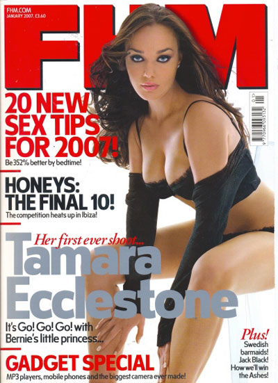
I looked at different magazines to ensure that some of the other magazines to see if my magazine had any of the same conventions that others did. I found that FHM had the same colour scheme as I did, with the red, black and white, and they also had the sexualisation of a women on their front cover to entice men to look at their magazine.
 |
| FHM front cover |
The magazine front cover here is similar to mine, they have used a bold title just as I did. The title allows the magazine to stand out and ensuring it is bold means this is likely to happen. The colour red has been proven to entice men and is seen as a more sexual/attractive colour, therefore the use of red shows how my magazine and FHM is largely aimed at men.
I then looked at other magazines double page spread, I found one. I reallised my magazine was completely different, their double page spread was more aimed at a mixed gender I suppose. They had a completely different layout to myself, different colours and a different type of context. Originally this was worrying, however I had to consider that my magazine was aimed at a completely different audience to this one, therefore the forms and conventions would be completely different to eachother.
In some ways I challenged the forms and conventions of a typical music magazine by making it more sexual and fun. I used many different aspects of convey the message of sex and music, so that the reader would be fully aware of what the magazine was about. I ignored things such as using lots of different fonts as I wanted my magazine to have a certain consistancy so people could differentiate that font from others and possibly associate it with my magazine.
Friday, 9 March 2012
Magazine Cover, Double page spread and contents page
 Magazine Cover
After recieving response on my magazine cover I have decided to change my magazine cover completely. I have made it more catchy and less boring, it has more to look at.
Double page spread
The double page spread is made to be aimed at guys who want to be like a stud, someone who is a player. In the article he tells of his wild adventures with ladies but also combines coversation about his music. It is intended to have a mix between the music and the player lifestyle.
Contents page
My contents page has the silouhette of an lady which shows immediately the magazine is sexualise.


Wednesday, 1 February 2012
Magazine research- Playboy Magazine
Due to my magazine being aimed at young men and being done in the theme of the sexuality of woman and the type of men being players, I have been conducting some research into a magazine which kind of relates to my magazine however in a more hardcore sense. I am researching Playboy magazine which is a soft porn magazine which is also fairly upper market due to the price of it.
The Playboy magazine and what it has become.
The magazine was founded in 1953 by a young ambitious man called Hugh Hefner, he founded it through $1000 dollars he received from his mother. The magazine started off as just that, however in the years up to now it has become one of the best known brands with not only a magazine but different products coming off it such as clothing, TV series, nightclubs and websites. All of this falls under the name Playboy Enterprises INC. The circulation of Playboy magazine is around 4.5 million each month worldwide which is a lot considering the price of the magazine. The circulation varies because although it is 4.5 million usually, in some additions it has gone up to 7.1 million with different people who are on the front.
The magazine is not going down, they have however recently adapted their magazine to an app which could suggest their sales are becoming higher through technology. The magazine still however does sell 4.5 million on average every month, however other magazine such as Loaded which is another men’s magazine has dropped in sales leaving them selling 49,000 copies a month which is a 30.8% drop since it started in the 1990’s. Playboy has not had a drop so big, however they have obviously overcome the need for an app or online interaction for their magazine. Although this is a clear indicator that Playboy are managing to keep high sales figures throughout the world.
Playboy magazine did not have a rate card for it anywhere online, however they did have one in South African currency but that was not appropriate for what I was looking for. However I did find out some of the other information about it.
Magazine publisher and size of the company

The magazine is published from within its own company which is Playboy Enterprise which is all under the founder of the magazine, Hugh Hefner. He owns the company and publishes it too. The company is a large company and owns a lot of media such as magazine, TV shows/channels, Radio channels and websites. The company owns a lot of media and is well broadcast throughout the world, you can access most of their products in the UK as they work within the UK as well as America. The company is a global company and I broadcast throughout the world with different versions for different countries.
Convergence and Synergy
Playboy magazine uses convergence to interlink it magazine with things such as the internet, apps and radio. They promote it all and link the ideas and theme throughout all these. They have their company in many different industries, their magazine being prodominantly their main industry though. They use synergy by making nightclubs and resorts which are coming off of the magazine ideas, they have used the idea to make it an experience you can actually do.
Technology convergence
Playboy have an online presence where you can view the things in the magazine online, you can also view multimedia online too such as videos. They also have an app. The relationship between the magazine and the internet it quite strong because as it is a mens soft porn magazine they are more enclined to possibly want more than pictures, i.e. videos. The online website gives you a chance to look at more than just the magazine, and offer more things. If you go onto the magazine section you’re able to view the articles that have been in the magazine and videos which may have been advertised in the magazine.
The magazine is promoted online with options to subscribe to the magazine and become a member of it. They offer you the chance to subscribe with links to click on which is in the view of the reader, they are given it so that the magazine gets more buyers. There seems to be a direct link between the internet and the magazine as they both promote each other.
Relationship between encoder and decoder
The relationship between the encoder and decoder is very much based on the decoder. The encoder has a clear view on the general type of reader and what he would like to read about or view. The pictures and articles are aimed at young men who have a want for the ‘jet set’ lifestyle with articles talking about fast cars and beautiful women.
The website also allows the user to comment and offer their opinion on certain articles which allows them to feel part of it. They are able to comment which can help the encoder get ideas or advance on their original idea.
Content

The magazine is aimed at the target audience who like women, the finer things in life, exhilarating and fun things and the things that stereotype young guys like. The magazine and internet have the theme of sexual things which are fun and nice throughout the magazine and internet. The design with the colours is actually fairly similar to how I am doing my magazine with the colours of red, white and black. The magazine does not offer videos but online you’re able to view videos of interviews, photo shoots, etc.
Thursday, 12 January 2012
Front Cover Photo selection

This is the photo that I selected for my front cover, I chose this photo as it is face on like most front covers are.
The picture will have editing done to it and probably colour changes but it will still be that photo.
Front Cover
My original front cover was the previous one posted, however after feedback from the teacher I have decided to change my front cover, not too much but changing it around so it looks better and more magazine like than before.
 This is the old magazine cover which I originally had, the colours made it look childish and not like a magazine which I decided I did not like, I took the constructive criticism on board and changed my magazine about.
My new magazine shows the theme that I wanted to have, it makes it more obvious than before because the previous magazine cover did not show the sexuality I wanted to, whereas it is more apparent now.
My new magazine looks more professional than it did before, and it also puts the idea I wanted across which makes it better than before.

Double Spread Mock up

Double Page spread ideas
My double page spread will be very sexual, only replicating the front cover. It will be done in the theme of this;

This double page spread is the kind of spread I want to replicate although I will make it fit into my theme of the sexuality of the people in the music industry, so instead of having less revealing photos, I would have ones which are similar to my front cover so the theme of my magazine is not lost through this.
The double page spread photos will be taken against a white background and the model will be in short, revealing clothing in fun, outgoing poses throughout the shoot. She will be standing up, but different bodily forms, i.e. standing with her arms out, or something along those lines.
The double page spread will also feature an interview and description about the person, Hannah Stevens, and this will be also according to the theme of my magazine, being a sexual ludacris article which will appeal to men mainly, but woman could also enjoy too.
The double page spread will only enhance that the theme of the magazine and how I want the magazine to come across.

Subscribe to:
Comments (Atom)