Showing posts with label Planning. Show all posts

Thursday, 12 January 2012

Front Cover Photo selection

Photo for front cover
This is the photo that I selected for my front cover, I chose this photo as it is face on like most front covers are.
The picture will have editing done to it and probably colour changes but it will still be that photo.

Front Cover

My original front cover was the previous one posted, however after feedback from the teacher I have decided to change my front cover, not too much but changing it around so it looks better and more magazine like than before.
This is the old magazine cover which I originally had, the colours made it look childish and not like a magazine which I decided I did not like, I took the constructive criticism on board and changed my magazine about.
My new magazine shows the theme that I wanted to have, it makes it more obvious than before because the previous magazine cover did not show the sexuality I wanted to, whereas it is more apparent now.
My new magazine looks more professional than it did before, and it also puts the idea I wanted across which makes it better than before.

Double Spread Mock up

This is a mock up of what my front cover will look like when it is done, it will look like this in the structure when it is done. I have taken great inspiration for the previous double spread I have shown previously.

Double Page spread ideas

My double page spread will be very sexual, only replicating the front cover. It will be done in the theme of this;
 This double page spread is the kind of spread I want to replicate although I will make it fit into my theme of the sexuality of the people in the music industry, so instead of having less revealing photos, I would have ones which are similar to my front cover so the theme of my magazine is not lost through this.
The double page spread photos will be taken against a white background and the model will be in short, revealing clothing in fun, outgoing poses throughout the shoot. She will be standing up, but different bodily forms, i.e. standing with her arms out, or something along those lines.
The double page spread will also feature an interview and description about the person, Hannah Stevens, and this will be also according to the theme of my magazine, being a sexual ludacris article which will appeal to men mainly, but woman could also enjoy too.
The double page spread will only enhance that the theme of the magazine and how I want the magazine to come across.

Friday, 25 November 2011

Magazine front cover

This is my previous front cover which I had before I decided to change the colour scheme, I decided to change this because it looked a bit too 'teen pop' magazine rather than the sexual/music magazine I was going for!

Tuesday, 8 November 2011

Photo selection

 The photos for the article
These are the photos I have selected for my article that I am going to do for the magazine I am producing. I have very much been influenced by the the music magazine 'Vibe' in making their pictures more sexual and flirty. As the idea of my magazine is to attract men, I have an interest in making the pictures more sexual but relating to music as well.


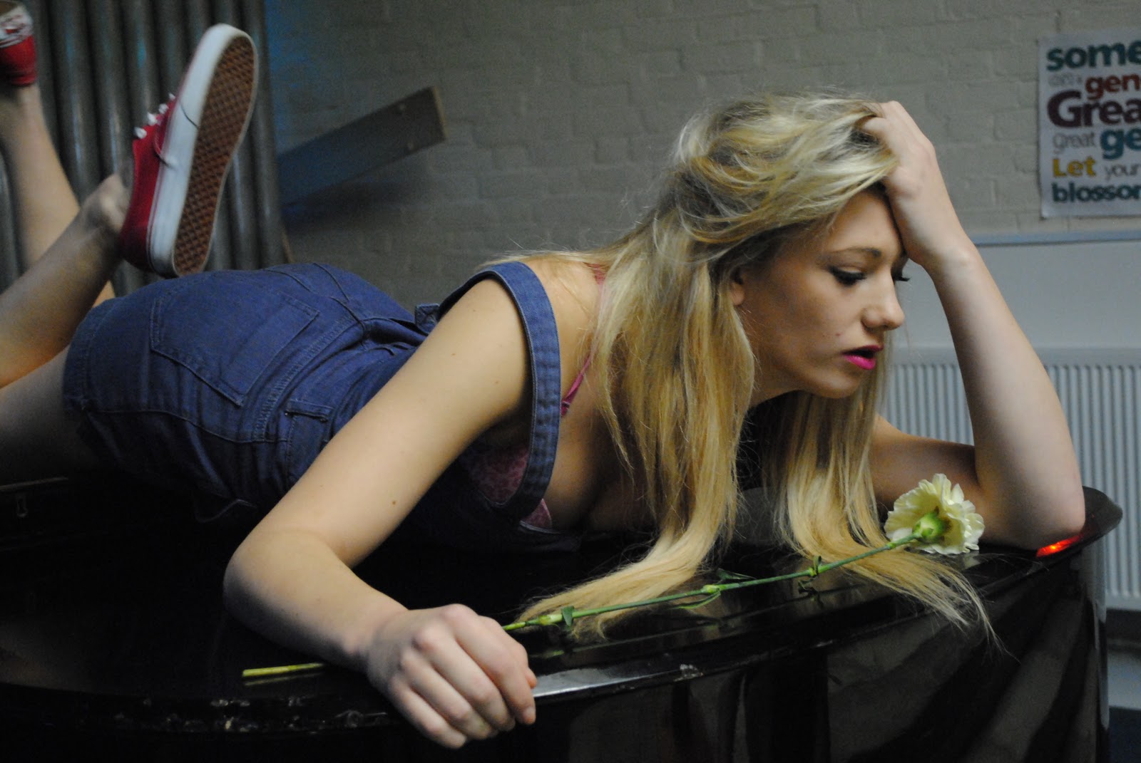
These are the pictures which I will choose from to use for my front cover


Friday, 14 October 2011

Plan on actual front cover

Logo- The logo is  aimed at young, high flying men who like to have fun and go out clubbing etc. It is quite bright and attracting, which would draw them in. I have chosen this because it is bright and colouruful.

Main cover photo- I am going to have a picture of my friend, who is a girl, posing provocatively as it is aimed at men. She will be wearing minimal clothing to ensure that the link between the men’s magazine, a provocative woman and the word UP, it all links together to entice my target audience (young men, into the player lifestyle). I will use medium shot to show my audience the “star” and also create sex appeal. It is close up of her face, a her body in the back. I will construct this photo
Influence- My main influence from other covers was vibe magazine, I liked how it was bold and bright yet looked professional too. I didn’t have a set magazine for the influence of aiming it at young player influenced by people preferably by programmes such as ‘Made in Chelsea’, as the people on there fit my criteria.
Font- The font I will use will most likely be bold, bright and attracting as this will keep them enticed and keep it “hip”. I wanted bright, electric colours to keep it entertaining and bright, and the font will be straightforward, i.e. Ariel font.
Articles- I will have articles about people which features people from my main cover photo either about her social life or new and upcoming music she has planned for her next CD or something.
I intend to make my front cover new and up to date, I want it to attract young people.

Monday, 12 September 2011

AS media coursework diary

Friday 9th September- I have created my blog and briefly learnt what we are to do.

Monday 12th September- I have now anaylysed a magazine cover and described why it appealed to me, we also did forms and conventions on this magazine cover. I have also been introduced to CorelDraw.